Case Study
PROJECT OVERVIEW
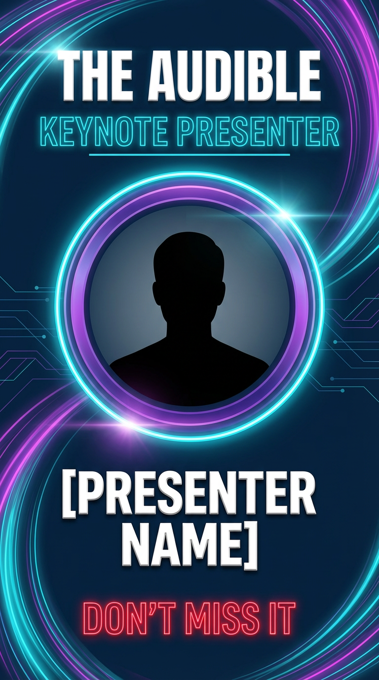
Client: Umbral Starcade LLC — Audible Event/Conference
Industry: Esports, Technology & Work/Entrepreneur Development
Services Provided: Logo Design, Brand Identity
Timeline: 2 Weeks
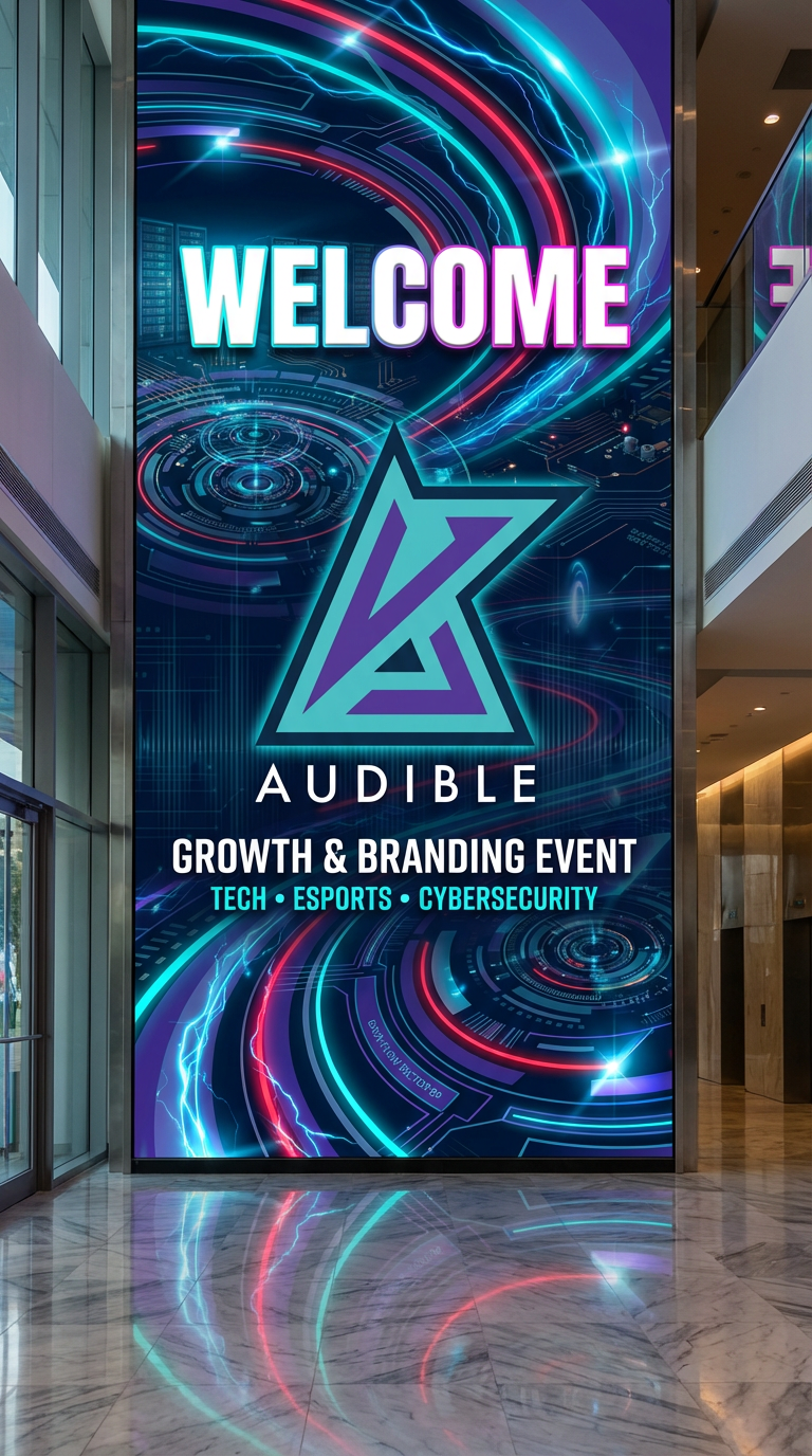
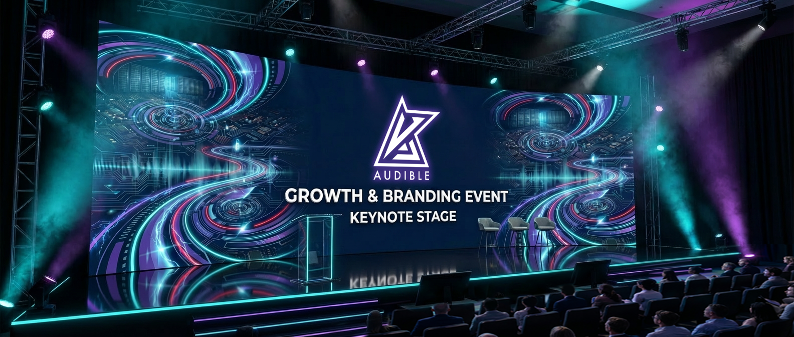
Goal: Develop a dynamic, versatile logo system for Audible, a multi-day growth and branding event centered on esports, cybersecurity, technology, networking, and entrepreneurship. The identity needed to reflect innovation, energy, and cross-industry collaboration while remaining adaptable across digital, print, and experiential environments.
THE CHALLENGE
The primary challenge was creating a logo that could authentically live within the esports space while also extending into technology, cybersecurity, and professional workforce development sectors.
The brand needed to:
• Appeal to a wide demographic range
• Balance high-energy gaming culture with
professional credibility
• Maintain visual consistency across multiple
industries and applications
Additionally, the identity had to feel modern and innovative without becoming overly niche or limiting in its execution.
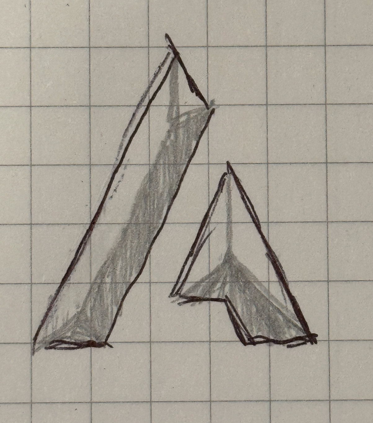
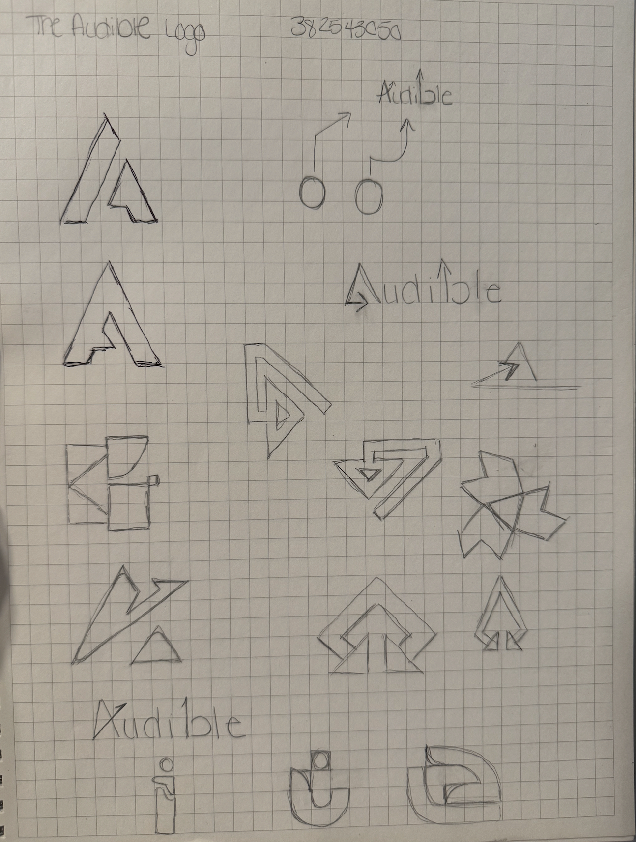
THE APPROACH
Discovery & Research: Conducted in-depth research across esports branding, tech industry visual systems, and color psychology. Explored the concept of a “football audible” as a strategic pivot, aligning it with themes of adaptability, quick thinking, and leadership.
Concept Development: Explored combinations of wordmarks, symbols, and iconography to ensure flexibility across use cases. Developed multiple logo directions that blended:
• Esports-inspired visual energy
• Strategic motion and play-calling symbolism
• Clean, tech-forward structure
Refinement: Collaborated with the client to refine a direction that emphasized:
• Strong visual hierarchy
• Bold, futuristic styling
• Clear readability across platforms
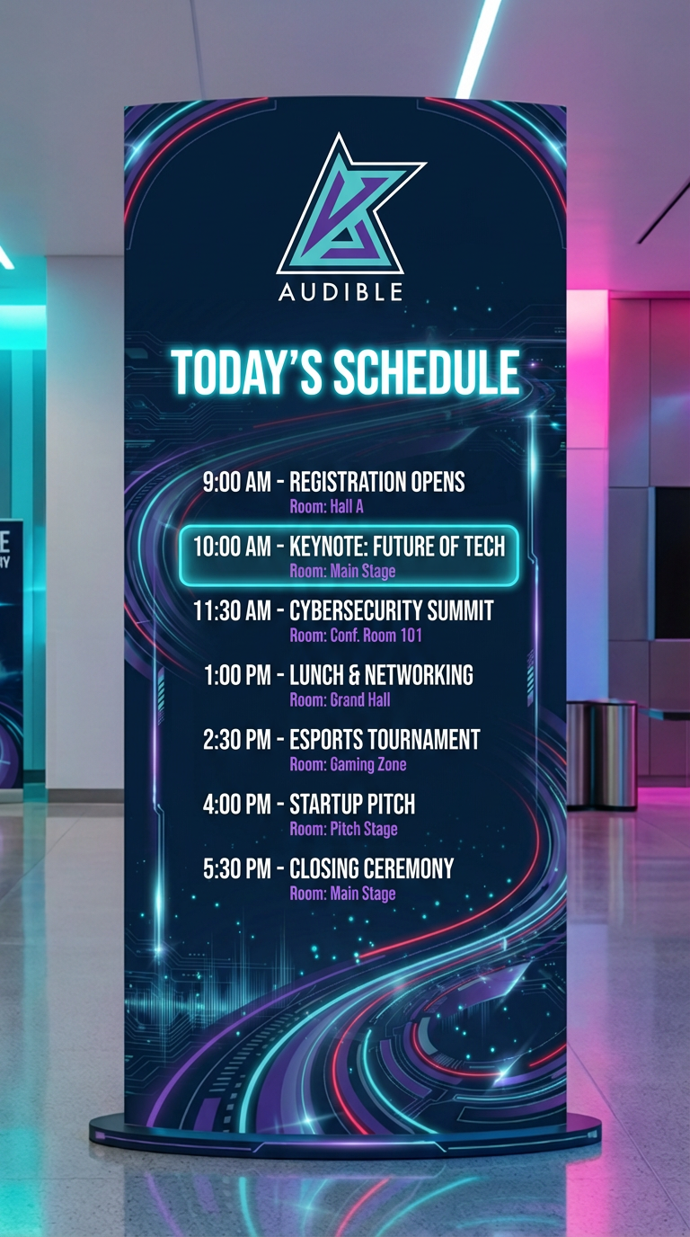
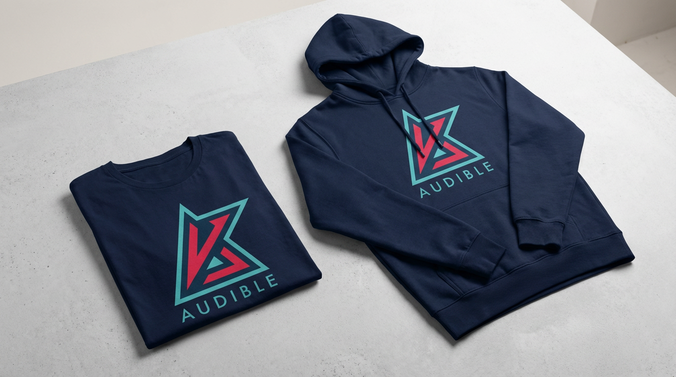
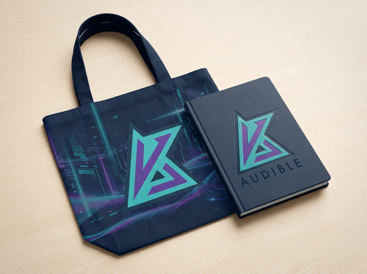
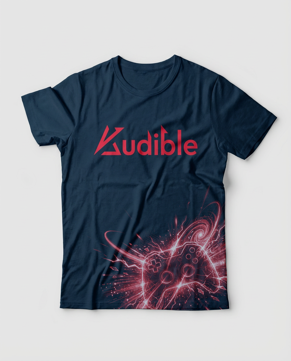
Expansion: Built a comprehensive logo suite, including:
• Primary Wordmark logo
• Icon Wordmark Lockup (Secondary Logo)
• Submark/icon
Each variation was designed for scalability across merchandise, digital platforms, and event environments.
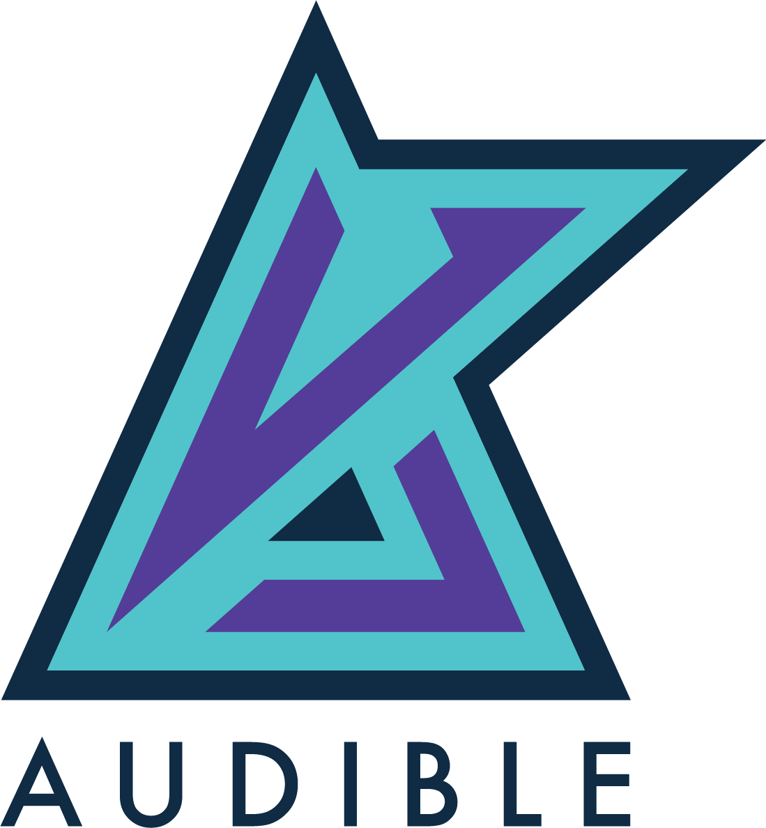
THE SOLUTION
Logo System:
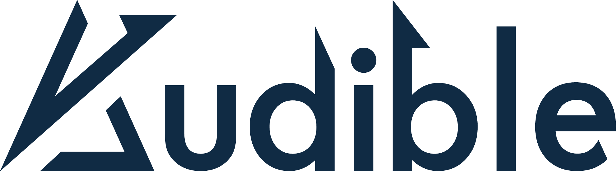
• Primary Wordmark: Clean, structured typography (Futura-based) for clarity
and versatility
• Icon Wordmark Lockup: Bold, modern mark capturing motion, energy,
and strategic execution
• Submark/Icon: Compact symbol for social, merch, and small-scale applications
Color Palette: This palette delivers a high-impact, futuristic aesthetic.
• Navy: Stability and professionalism;
• Cyan: Innovation and speed;
• White: Clarity and balance;
• Purple: Creativity and strategy;
• Neon Red: Energy and competitive intensity
Typography:
• Geometric sans-serif (Futura-inspired) to reinforce a modern,tech-forward identity
RESULTS
Established a cohesive and scalable visual identity across multiple industries
Increased brand versatility for events, merchandise, and digital platforms
Positioned Audible as a forward-thinking, multi-industry experience
Created a strong foundation for future growth, partnerships, and recognition
KEY TAKEAWAY
By blending esports energy with strategic, tech-driven design, this identity successfully bridges multiple industries, proving that bold, adaptable branding can unify diverse audiences under one powerful visual system.