Case Study

PROJECT OVERVIEW
Client: STRich Designs LLC (Practice)
Industry: Skincare and Beauty
Services Provided: Logo Design, Brand Identity,
Social Media Campaign
Timeline: 24-Hour Creative Challenge
Goal: Develop a mock brand for an organic, minimalist skincare line rooted in fruits, vegetables, and herbs. The objective was to create a cohesive brand system, including logo suite, visual identity, product concept, and campaign direction, within a rapid turnaround timeframe.
THE CHALLENGE
The primary challenge was to build a fully realized brand from scratch within 24 hours while also stepping into a new industry space (skincare & beauty). The brand needed to:
• Feel premium yet natural
• Stand out in a highly saturated clean beauty market
• Communicate both ingredient integrity and
emotional wellness
• Translate effectively across social-first platforms
THE APPROACH
Discovery & Research
Defined the brand foundation and narrative:
Brand Essence: VitaAura is where nature meets energy, a skincare experience designed to nourish not just the skin, but the presence you carry.
Tagline: Your Aura, Revitalized
Brand Meaning:
• Vita = Life, vitality, nourishment
• Aura = Energy, glow, presence
Positioning:
• Clean / Organic Skincare
• Botanical + energy-inspired wellness niche
Target Audience:
• Women and men (25–45)
• Wellness-focused, ingredient-conscious consumers
• Individuals who value ritual-based self-care
Brand Promise: Skincare that feeds your skin and revives your energy
Creative Direction & Campaign Development
Developed a campaign centered on emotional + physical transformation:
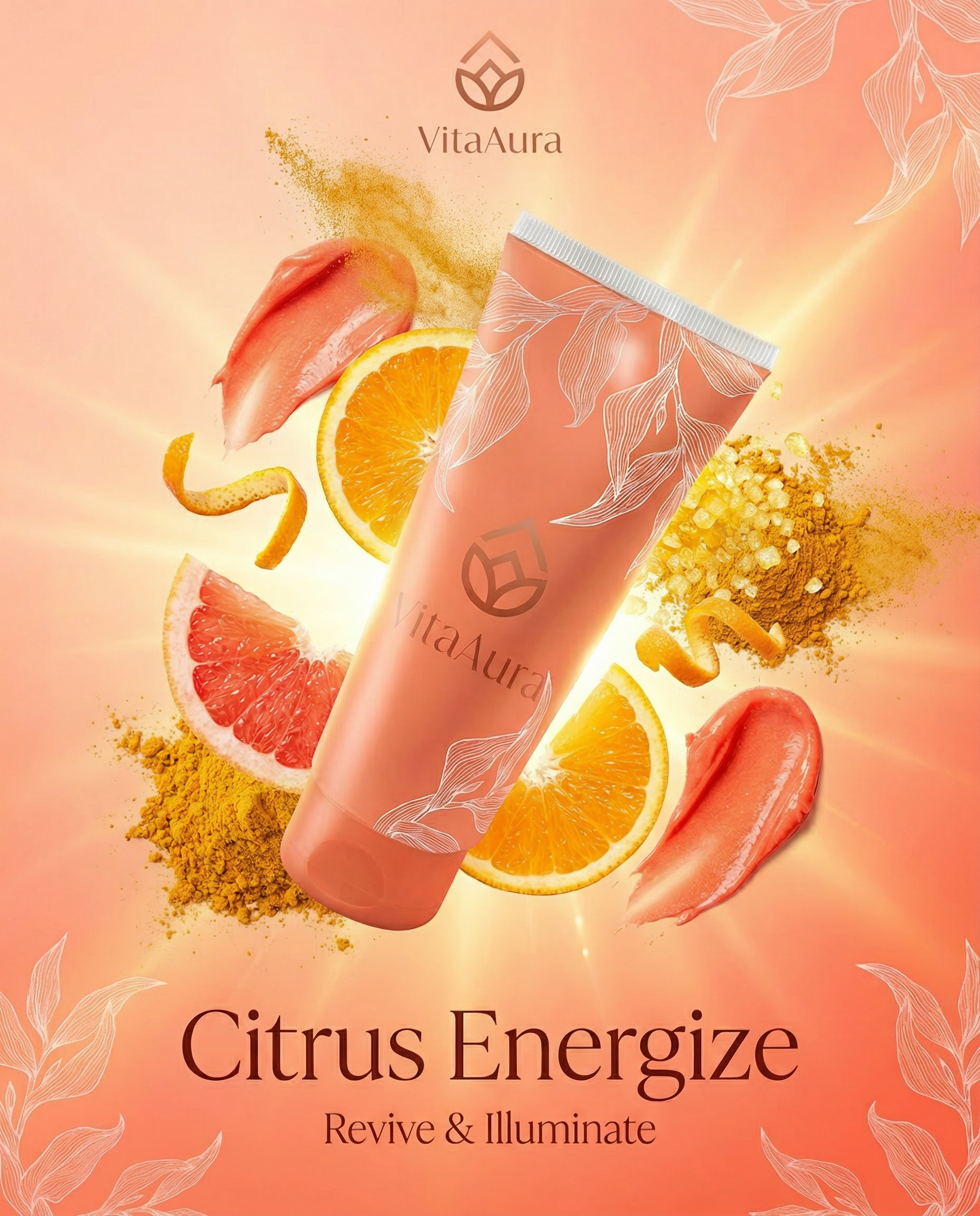
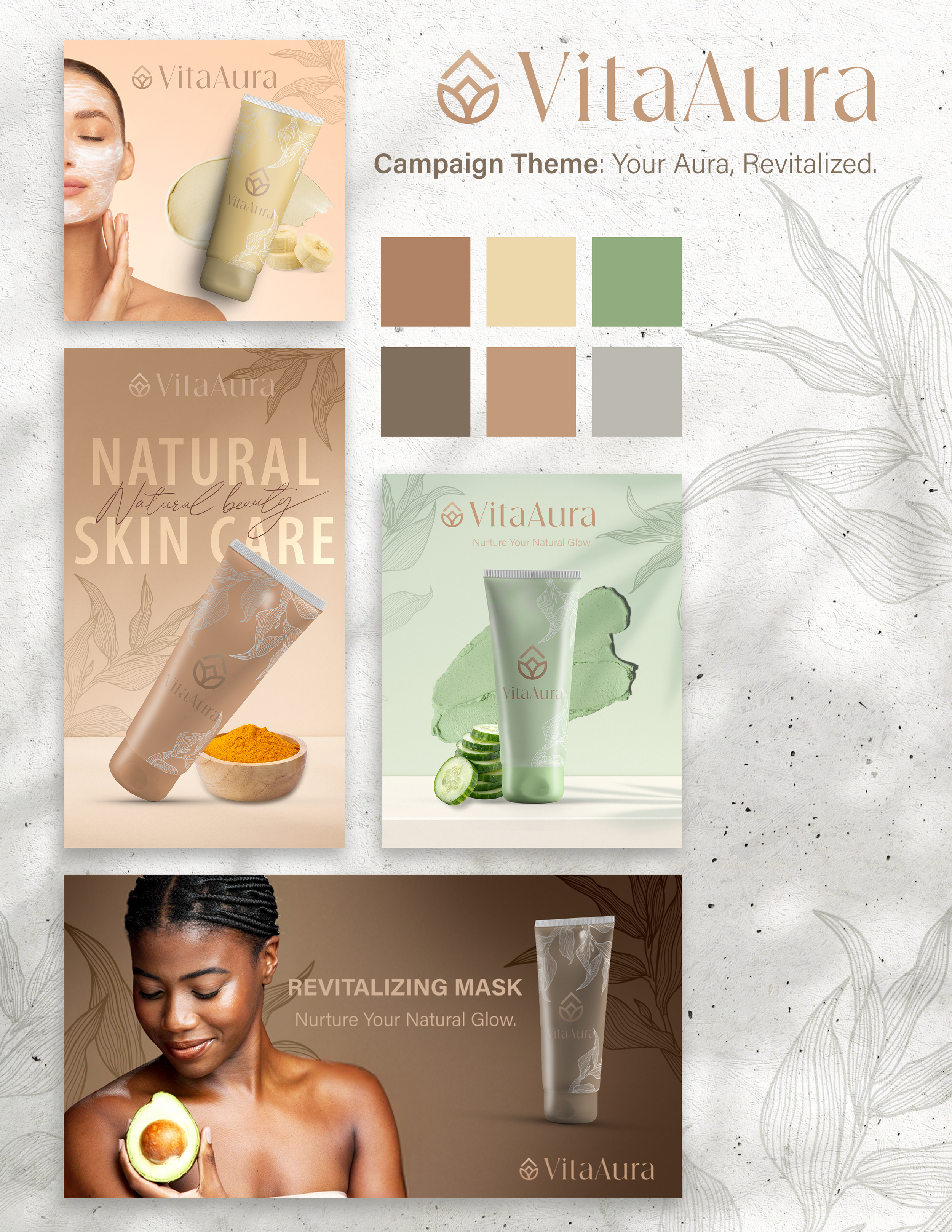
Campaign Theme: Your Aura, Revitalized
Core Concept: Skin health → emotional energy → confidence
Core Message: Your glow isn’t just surface-level. When your skin is nourished, your aura shifts.
Product Focus (Campaign Execution):
• Designed a hero product concept for social media rollout:
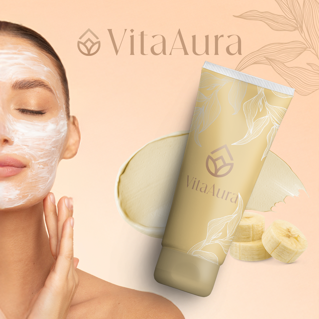
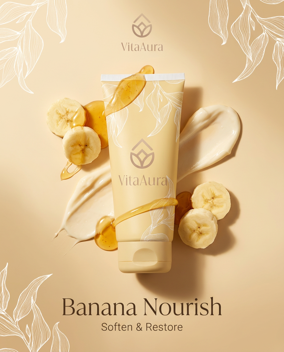
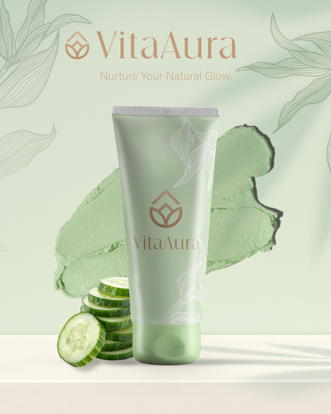
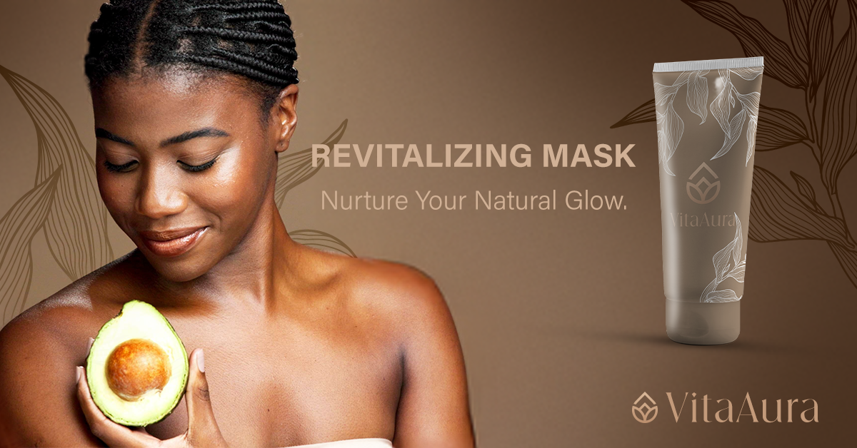
• Green Renewal Mask - Detoxifying, restorative, energy-reset skincare
Visual Identity Development
Built a comprehensive and scalable identity system:
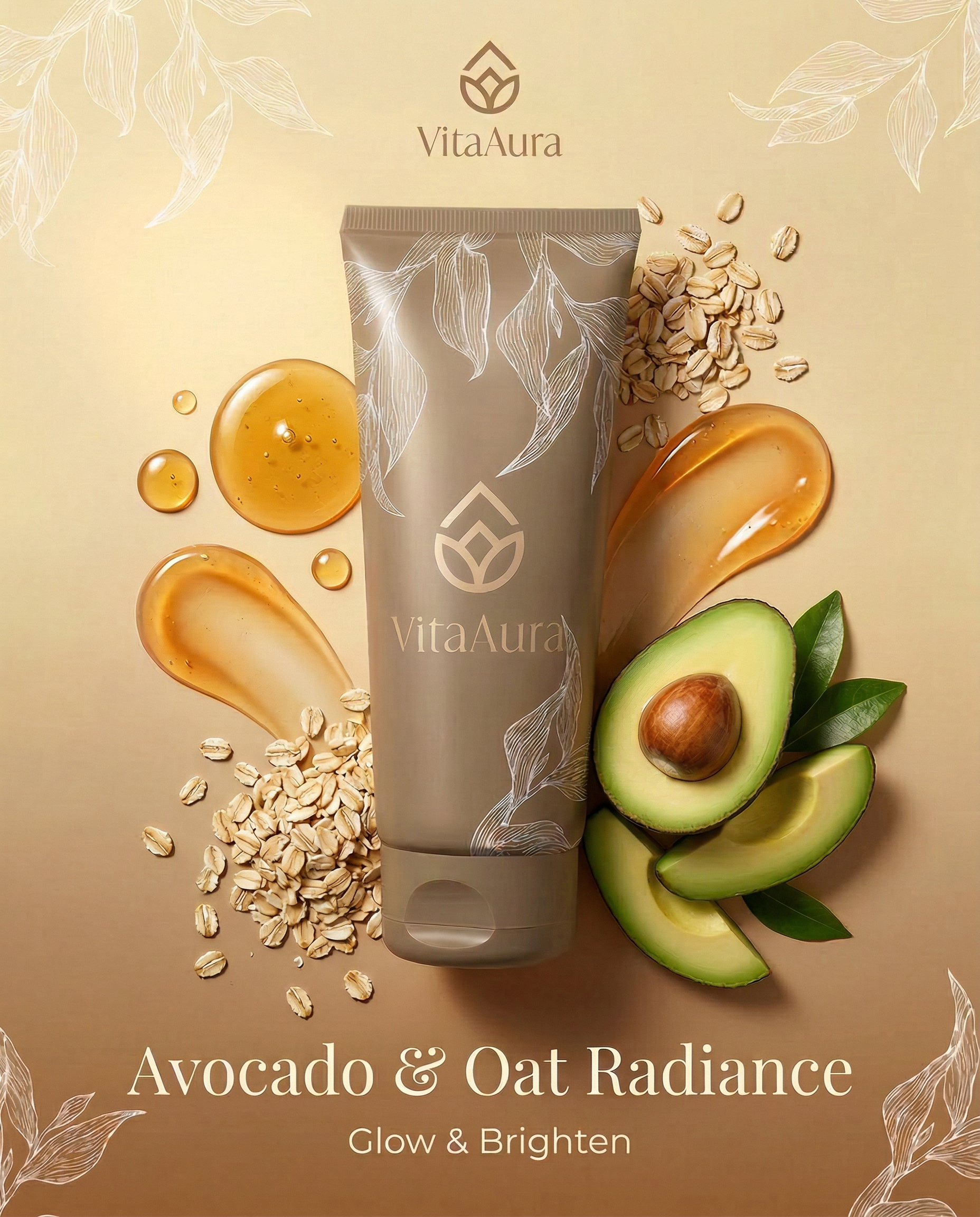
Logo Suite: Primary Logo, Wordmark, and Submark/Icon
Designed for versatility across: Packaging, Social media, and Digital storefronts
THE SOLUTION
Visual Identity System
Color Palette:
Sage Green - Represents growth, renewal, and balance.
This is the brand’s anchor color, evoking freshness and botanical purity.Soft Cream - A clean, airy neutral that adds warmth and softness. It creates breathing room and reinforces the brand’s minimalist, organic feel.
Warm Clay - Grounded and earthy, this tone reflects natural ingredients like roots and herbs, adding depth and authenticity.
Muted Terracotta - A warm, skin-inspired hue that connects directly to beauty and complexion, reinforcing the skincare focus.
Earth Brown - Rich and stabilizing, this shade anchors the palette and introduces a sense of trust, longevity, and natural sourcing.
Soft Gray - A modern neutral that balances the warmth of the palette, providing versatility for layouts, backgrounds, and digital applications.
Typography: Elegant Serif (primary) paired with clean, modern sans-serif support
Design Style:
• Minimal yet sensory
• Botanical overlays + soft gradients
(aura-inspired)
• Diffused lighting and glow effects
• Ingredient-forward visuals
Product & Packaging Concept
• Matte neutral containers
• Subtle ingredient-based color coding
• Minimal labeling with botanical illustrations
• Soft gradient halos to symbolize energy and aura
Social Media Campaign Deliverables
Campaign Theme: Your Aura, Revitalized
Visual Style: Soft neutrals, botanical textures, clean grid layout
Tone of Voice: Calm, elevated, nurturing, and aspirational
Deliverables: 9 Feed Posts; 4 Story Templates; 2 Reels Cover Sets; Hashtag and Caption Strategy
RESULTS
Successfully developed a full brand identity system within 24 hours
Created a cohesive, scalable visual language adaptable across digital platforms
Demonstrated ability to translate strategy into rapid execution
Produced a concept with strong market viability in the clean beauty space
KEY TAKEAWAY
Through strategic clarity and intentional design, VitaAura demonstrates how a brand can balance natural ingredients with emotional storytelling, creating not just skincare but a sensory experience rooted in energy, wellness, and glow.